Table of Contents
Balancing Privacy and Progress
In the dynamic and ever-evolving realm of digital technology, ensuring a flawless and harmonious user experience across an array of diverse devices stands as an unequivocal imperative for contemporary web designers and developers alike.
This unceasing challenge has given rise to two distinct yet equally consequential methodologies: adaptive design and responsive design. Each of these approaches is poised to address the multifaceted landscape of modern user interactions but with distinct strengths, complexities, and implications. Consequently, the pivotal crossroads at which one must discern between these methodologies holds an undeniable significance. Within the confines of this article, we shall embark on an illuminating journey, delving into five pivotal tips that stand as guiding beacons amidst the labyrinthine process of decision-making.

Adaptive vs Responsive 5 Points
In an endeavor to equip you with the insights and perspectives required, we navigate the intricate terrain of this choice, forging a path toward a judicious selection that aligns harmoniously with your project’s unique demands and user-centric aspirations.
Tip 1: Understand the Fundamental Concepts:
Before delving into the decision-making process, it’s essential to understand the fundamental concepts behind adaptive and responsive design. Responsive design employs fluid grids, media queries, and flexible layouts to ensure that a website adapts and scales gracefully across different screen sizes and devices.
Tip 2: Analyze User Behavior and Context:
A key factor in choosing between adaptive and responsive design is understanding user behavior and context. Adaptive design enables personalized experiences by considering user segmentation and context-awareness.
Tip 3: Evaluate Content and Layout Complexity:
The complexity of your website’s content and layout play a significant role in the choice between adaptive and responsive design. Responsive design works well when content can be rearranged and resized without sacrificing clarity or usability.
Tip 4: Consider Development Time and Resources:
When choosing between adaptive and responsive design, it’s crucial to consider development time and resources. Responsive design generally requires less initial development time, as you’re creating a single layout that adapts to different screens.
Tip 5: Plan for Future Scalability:
As the digital landscape continues to evolve, the scalability of your chosen design approach becomes vital. Responsive design inherently provides a level of future-proofing, as it adapts to new devices and screen sizes as they emerge.
Tip 1 Understand the Fundamental Concepts
In the dynamic and rapidly evolving landscape of the digital realm, the pursuit of crafting a user experience that seamlessly transcends the boundaries of diverse devices has risen to the forefront of priorities for web designers and developers alike. As technology continues to diversify and user expectations become increasingly sophisticated, the need to design interfaces that flex and adapt to varying screen sizes, resolutions, and device capabilities has never been more pressing.
Within this context, two prominent paradigms have emerged as the vanguards of modern web design: adaptive design and responsive design. These methodologies stand as manifestos of adaptability, each addressing the intricate challenge of catering to a multitude of devices and their distinct characteristics. However, their approaches diverge, each offering its own distinct blend of strengths and intricacies. Consequently, the choice between these two approaches holds immense significance, influencing the trajectory of user experiences and the impact of digital interfaces.

Responsive Design: Harmonizing Diversity
Responsive design is akin to orchestrating a symphony where diverse instruments converge to create a harmonious composition. It is grounded in the tenets of fluidity and adaptability, employing a triad of foundational elements to craft an interface that remains consistent and visually appealing across the vast expanse of devices. Fluid grids serve as the backbone, ensuring that the proportions and arrangements of elements within the interface adjust gracefully as screen sizes shift.
Intelligently woven into this symphony are media queries, the virtuosos of responsive design. These code snippets possess the uncanny ability to discern the characteristics of the viewing device and apply corresponding style rules accordingly. Consequently, a website’s interface is rendered with meticulous consideration for factors like screen width, resolution, and orientation.
Flexible layouts constitute the crescendo of responsive design, enabling content to be reorganized and reshaped dynamically. This dynamic rearrangement allows for a seamless transition from desktop displays to mobile screens, ensuring that content remains engaging, legible, and interactive regardless of the device. The culmination of these elements produces a symphony of visual harmony, with interfaces that gracefully adapt and evolve as users traverse the digital landscape.
Adaptive Design: Tailoring Precision
In contrast to the fluid symphony of responsive design, adaptive design is a gallery of bespoke experiences tailored for each device. Much like a tailor crafts unique garments for specific body types, adaptive design tailors individual versions of a website for designated devices or device categories. This meticulous approach ensures that the interface resonates intimately with the unique characteristics and expectations of each device.
The heart of adaptive design lies in the creation of distinct layouts and interfaces that cater to the nuances of various devices. By understanding the attributes of each device – from screen size and resolution to processing power – designers curate experiences that exploit the full potential of each platform. This level of customization can lead to interfaces that not only adapt but also excel within specific device contexts, offering users an experience that feels inherently suited to their chosen device.
Setting the Stage for Informed Decisions: The Role of Understanding
Before embarking on the intricate journey of decision-making between adaptive and responsive design, it is imperative to lay a solid foundation of comprehension. Grasping the fundamental differences between these methodologies becomes the rudder that steers the course of design. Responsive design relies on the dynamic interplay of fluid grids, media queries, and flexible layouts, harmonizing diverse devices into a cohesive user experience. Adaptive design, on the other hand, orchestrates a spectrum of tailored experiences, ensuring that interfaces resonate harmoniously with each device’s capabilities.
This understanding is the bedrock upon which informed decisions are built. It provides designers and developers with the tools to dissect their project’s objectives, user profiles, content intricacies, and resource allocations. Armed with this awareness, the intricate web of considerations gains clarity, and the path forward becomes discernible.
Tip 2 Analyze User Behavior and Context
At the heart of the deliberation between adaptive and responsive design lies a pivotal determinant: a profound comprehension of user behavior and the contextual landscape in which their interactions unfold. This understanding forms the bedrock upon which the edifice of an optimal user experience is erected. Within this intricate web of user preferences, expectations, and device contexts, adaptive design emerges as a beacon of personalized engagement. It beckons designers to navigate the labyrinthine intricacies of user segmentation and context-awareness. By meticulously dissecting user personas, demographics, and the specific circumstances under which interactions occur, adaptive design crafts interfaces that don the robe of tailor-made experiences.
The symphony of user-centricity orchestrated by adaptive design embraces the nuances of individuality, weaving a tapestry of interactions that resonates intimately with each user. This orchestration, in turn, requires a deep dive into the annals of user insights, a foray that unveils preferences, habits, and favored devices. By deconstructing this rich tapestry of data, designers unravel the threads that connect user personas with the devices that often extend as an extension of their identities.
On the other hand, responsive design stands as a chameleon of universality, draped in the cloak of adaptability. It harmonizes the presentation of content across a gamut of devices, embracing the ebb and flow of screen dimensions and resolutions. Yet, within its accommodating folds, responsive design might not afford the same degree of personalized intimacy as its adaptive counterpart. The intricate symphony of user segmentation and context-awareness, which adaptive design choreographs, is replaced by a more generalized harmony that resonates across devices.

In the realm of responsive design, the emphasis pivots toward a seamless and consistent experience, one that gracefully adapts content and layout to suit different screens. The spectrum of personalization, while present, is nuanced and might not encompass the same degree of intricacy achievable through adaptive design. This aspect is a trade-off, a concession to universality that ensures a satisfactory user journey for a diverse range of devices, without necessitating the granularity that adaptive design embodies.
In essence, the choice between adaptive and responsive design entails a delicate balance between personalization and universality, with each approach carving its distinctive niche in the landscape of user experience. As we move forward in our exploration of these two methodologies, it becomes evident that the context of user behavior, preferences, and the array of devices they embrace becomes an indomitable force shaping the contours of design decisions. The tapestry of interactions we weave for users is an ode to their distinctiveness, resonating with the symphony of their expectations and leaving an indelible mark upon the digital canvas.
Tip 3: Evaluate Content and Layout Complexity
Responsive design, with its fluid grids and dynamic rearrangements, thrives in environments where content can elegantly flex and adapt across different devices. It is akin to a versatile actor who seamlessly transitions between diverse roles, always ensuring that the narrative remains coherent and engaging. When your website’s content possesses the innate ability to be reshaped and resized without compromising its essence, responsive design is the star that illuminates the digital stage.
The inherent harmony within responsive design lies in its capacity to retain clarity, legibility, and usability across devices. Content gracefully flows, images scale seamlessly, and interactions remain consistent, ensuring that users encounter a coherent and engaging experience, irrespective of their chosen device. This universality of presentation is an inherent trait of responsive design, a testament to its prowess in harmonizing content complexity with diverse device profiles.
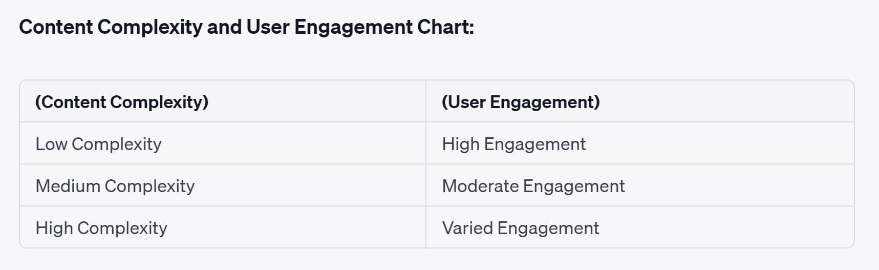
Adaptive Design: Precision in Intricacy
However, as the intricacy of your website’s content and layout deepens, adaptive design emerges as a resolute contender. Picture it as a master artisan, meticulously crafting bespoke experiences that resonate harmoniously with each device’s distinctive characteristics. When dealing with intricate layouts, unique design requirements, or specialized functionalities, adaptive design dons the mantle of tailored precision.
In the realm of adaptive design, every device is akin to a blank canvas waiting to be adorned with an exquisite masterpiece. Each layout is meticulously crafted, optimized to embrace the unique attributes and capabilities of its designated device. In this milieu, complex content maintains its integrity, ensuring that every intricate detail is showcased with finesse. By tailoring the experience to the idiosyncrasies of each device, adaptive design becomes an ally that empowers your website to transcend the constraints of device diversity.
Tip 4: Consider Development Time & Resources
Embarking on the juncture of selecting between the realms of adaptive and responsive design necessitates a judicious contemplation of the temporal and resource dimensions that underpin the construction of digital interfaces. The process of translating design visions into tangible digital landscapes is a symphony that harmonizes creativity, technical expertise, and the pragmatic constraints of time and resources.
Temporal Dimensions: A Tug of War
Responsive design, with its single fluid layout that elegantly shape-shifts across diverse screens, emerges as an ally that streamlines the voyage of design into implementation. The temporal aspect is akin to a dance with brevity, where the development journey is streamlined due to the singular canvas that accommodates the diverse devices. The time invested in crafting and fine-tuning a solitary layout allows designers and developers to usher in swift development cycles, reducing the temporal footprint and accelerating the journey from concept to execution.
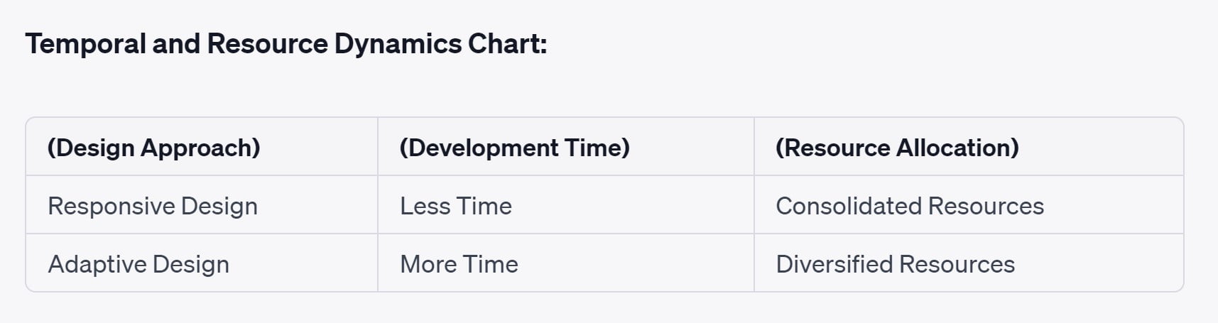
On the other hand, adaptive design, with its tailored experiences meticulously aligned with each device’s unique characteristics, paints a more intricate canvas. The temporal tides shift as the creation of multiple layouts demands a more prolonged engagement, deepening the intricacies of the development process. The dynamic interplay of multiple layouts requires meticulous orchestration, from coding to testing, elongating the development timeline. This heightened engagement period provides room for thorough refinement and attention to detail, but it inevitably draws upon the well of time resources.
Resource Allocation: A Delicate Balance
The allocation of resources, both human and technological, looms as another determinant in the adaptive vs. responsive design dialectic. Responsive design unfurls its flag as a pragmatic choice, as the singular layout harnesses a cohesive set of resources to cater to a diverse spectrum of devices. The allocation of development resources remains consolidated, simplifying the intricacies of design, coding, and testing. This concentrated resource allocation aligns seamlessly with the singular nature of responsive design, optimizing the synergy of creativity and technology.
In the realm of adaptive design, resource allocation unfolds as a more diversified symphony. The creation of multiple layouts, each a unique expression of tailored user experiences, fragments the allocation of resources across the spectrum of devices. This diversification necessitates a keen sense of resource management, ensuring that each layout receives its due share of expertise and effort. While it unveils the canvas for highly specialized and meticulously curated experiences, it does demand a more intricate orchestration of resources.
Tip 5: Plan for Future Scalability
Amid the ever-evolving tapestry of the digital realm, the forward-looking gaze takes center stage, compelling us to peer beyond the present moment into the vistas of future scalability. Responsive design, with its inherent adaptability, emerges as a sentinel of future-proofing. It carries within its essence an intrinsic responsiveness to the emerging devices and diverse screen sizes that are destined to shape the technological horizon. As new gadgets step onto the digital stage, responsive design orchestrates a seamless dance, gracefully accommodating their idiosyncrasies without necessitating substantial overhauls. Its innate fluidity, akin to the flowing currents of a river, ensures that the user experience remains engaging and unmarred by the tidal shifts of technological advancement.
In contrast, the realm of adaptive design presents a tableau where precision and personalization coalesce, albeit with a note of caution for future implications. While its tailored experiences paint a vivid canvas of interaction, they are anchored in specific layouts crafted for designated devices. This granularity can render adaptive design more susceptible to the cadence of technological evolution. As novel devices parade onto the digital runway, the need for ongoing updates and meticulous adjustments arises to align the experiences with these newcomers. The symphony of tailored interactions, while harmonious, might necessitate periodic tuning to resonate with the ever-changing chords of technological innovation. This begs the question of long-term sustainability, urging us to deliberate on the balance between the bespoke nature of adaptive design and the potential for recurrent adjustments to safeguard its relevance.
In the finale of our journey, we cast our gaze upon the composite landscape that encompasses user behavior, content complexity, development resources, and the promises of scalability. This holistic perspective empowers you to wield a discerning lens while making the fateful choice between adaptive and responsive design. The amalgamation of these factors crystallizes into a blueprint that not only navigates the present crossroads but also unfurls a trajectory toward a digital future that resonates harmoniously with your objectives, user expectations, and the dynamic pulse of technological progress.
Personalized Advertising in e-Commerce
Datafication has had a significant impact on the digital footprint of e-commerce platforms, especially in the realm of personalized advertising. Let’s consider a use case where datafication has played a pivotal role in improving the digital footprint of an online retail website.
Bottom Line:
Informed Decision-Making: A Symphony of Factors
The foundation of this decision lies in a deep understanding of the distinctiveness of adaptive and responsive design. Responsive design, with its fluid grids, media queries, and flexible layouts, unfurls a canvas where content dances gracefully across screens of varied dimensions. Its strength lies in creating a cohesive, uniform user experience that transcends devices, making it an ideal choice when content can adapt elegantly without sacrificing clarity or usability. On the other hand, adaptive design crafts tailored experiences, akin to bespoke garments that fit each device’s unique attributes. This approach thrives when content is intricate, diverse, or requires precise optimization, offering personalized interactions that resonate with users on a more intimate level.
Navigating this choice, however, extends far beyond the nuances of design. The symphony echoes through the corridors of user behavior, where understanding the context in which interactions unfold is paramount. Analyzing user preferences, their favored devices, and the intricacies of content consumption allows designers to create experiences that resonate harmoniously with user expectations. Furthermore, the prism of development time and resources casts its light on the implementation journey. Responsive design, with its singular layout, streamlines development cycles, leveraging consolidated resources. Adaptive design, while crafting bespoke experiences, demands a more diversified allocation of effort and time. Balancing these factors ensures that the chosen approach aligns with the project’s timeline and resource constraints.