
Table of Contents
Understanding Adaptive and Responsive Design
Understanding the intricate differences between Adaptive and Responsive Design is crucial. The way a website adapts to different screen sizes and resolutions impacts user experience directly. Making the choice between these two design approaches a pivotal decision for businesses and developers alike. This comprehensive guide illuminates the essential aspects of both Adaptive and Responsive Design. This empowers you to make a well-informed decision that best suits your needs.
The Importance of Device Compatibility
The diversity of devices used to access the internet is growing exponentially, necessitating a flexible and adaptive approach to web design. This approach ensures users have a seamless and enjoyable experience, regardless of the device they use. The rise of mobile internet usage, in particular, underscores the importance of optimizing websites for various screen sizes and resolutions. As a result, businesses must carefully consider their web design strategy to remain competitive and meet their audience’s expectations.

Adaptive Design: Customization
Adaptive Design focuses on creating multiple versions of a website, each tailored to a specific device or screen size. Designers develop distinct layouts for different devices, such as desktops, tablets, and smartphones. When a user accesses a website, the server detects the device type and serves the appropriate version of the site. This method’s primary advantage is its ability to deliver highly optimized and customized user experiences, leading to improved performance, as each version of the site is designed with the specific capabilities and limitations of the device in mind.
However, Adaptive Design also presents challenges. Developing and maintaining multiple versions of a website requires significant resources and time. Additionally, as new devices and screen sizes emerge, designers must continually update and create new layouts to keep pace with technological advancements.
Responsive Design: Flexibility and Fluidity
In contrast, Responsive Design takes a more fluid and flexible approach to web design. Instead of creating multiple fixed layouts, designers use a single, dynamic layout that adjusts and reflows content based on the screen size and orientation of the device. They achieve this through the use of flexible grids, fluid images, and media queries in CSS, allowing the website to adapt seamlessly to any screen size.
The main advantage of Responsive Design is its simplicity and scalability. With a single, adaptable layout, developers can provide a consistent user experience across all devices, reducing the need for extensive maintenance and updates, as the design inherently accommodates new devices and screen sizes. Despite its advantages, Responsive Design presents certain challenges. Achieving a truly seamless and optimized experience across all devices can be complex, requiring careful planning and testing. Additionally, responsive websites may face performance issues on certain devices, particularly if the design includes large images or complex elements that need to be scaled down for smaller screens.
Making the Right Choice: Adaptive vs. Responsive Design
Choosing between Adaptive and Responsive Design ultimately depends on your specific needs and goals. If delivering highly customized and optimized experiences for different devices is a priority, Adaptive Design may be the better choice. On the other hand, Responsive Design might be more suitable if you seek a more flexible and scalable solution. This is due to a wide range of devices with minimal maintenance.
What is Adaptive Design? UX for Diverse Devices
Adaptive Design is a strategic approach in web design that focuses on creating multiple fixed layouts. Each specifically crafted to cater to various device types and screen sizes. When a user accesses a website employing Adaptive Design, the site detects the type of device being used and selects the most appropriate layout for that particular screen size. This method ensures that the website provides an optimal viewing experience by delivering a layout that is perfectly suited to the capabilities and limitations of the device in use. The foundation of Adaptive Design lies in the use of breakpoints. These breakpoints are predefined sizes at which the design adapts to meet the specific needs of different devices.
Key Features of Adaptive Design
Breakpoints
Cross-Device Compatibility
User Experience (UX)
Breakpoints
Breakpoints are the cornerstone of Adaptive Design. These are specific points in the design where the layout changes to accommodate different screen sizes. For example, a breakpoint might be set for small screens (such as smartphones), medium screens (like tablets), and large screens (such as desktop monitors). At each breakpoint, the design adjusts its layout, ensuring that the content is displayed in the most effective and user-friendly manner. Breakpoints allow designers to create distinct layouts tailored to the unique characteristics of each device category. This helps provide a seamless and intuitive user experience.
Cross-Device Compatibility
One of the primary advantages of Adaptive Design is its ability to ensure cross-device compatibility. By developing multiple layouts optimized for various devices, Adaptive Design guarantees that a website will function and look great. Regardless of whether it is accessed on a smartphone, tablet, or desktop computer. This approach addresses the diverse needs and expectations of users across different platforms, enhancing the overall usability and accessibility of the website. Moreover, cross-device compatibility is crucial in today’s digital age, where users frequently switch between devices throughout their day.
User Experience (UX)
Adaptive Design places a strong emphasis on delivering a tailored user experience (UX) for each device. By customizing the layout for specific screen sizes, designers can optimize the presentation of content and functionality to suit the context in which it will be viewed. For instance, a mobile layout might prioritize easy navigation and quick access to key information. While a desktop layout might provide a more comprehensive and detailed view of the content. This tailored approach ensures that users have a positive and engaging experience, regardless of the device they are using. By addressing the unique needs and preferences of users on different devices, Adaptive Design helps create a more satisfying and effective interaction with the website.

The Mechanics Behind Adaptive Design
The process of implementing Adaptive Design involves several key steps, beginning with the identification of breakpoints. Designers must carefully analyze the target audience and the devices they are likely to use, determining the most appropriate breakpoints to accommodate these devices. Once the breakpoints are established, designers create distinct layouts for each breakpoint, ensuring that each layout is fully optimized for the intended screen size.
Next, the website’s server is configured to detect the user’s device and serve the corresponding layout. This detection can be based on various factors, such as the screen resolution, device type, and browser capabilities. When a user visits the website, the server identifies the device and selects the layout that best matches the detected characteristics. This process happens seamlessly and instantaneously, providing the user with an optimal viewing experience tailored to their specific device.
Advantages and Challenges of Adaptive Design
Advantages:
Customization: Adaptive Design offers a high degree of customization, allowing designers to create layouts that are specifically optimized for different devices. This customization can lead to better performance and a more engaging user experience.
Control: Designers have greater control over how content is displayed on various devices, ensuring that important information is always presented in the most effective manner.
Performance: By serving layouts that are specifically designed for each device, Adaptive Design can enhance the performance of the website, reducing load times and improving overall functionality.
Challenges:
Resource-Intensive: Developing and maintaining multiple layouts for different devices consumes time and is resource-intensive. This approach requires ongoing updates and adjustments to keep pace with new devices and screen sizes.
Complexity: Implementing Adaptive Design involves a higher level of complexity compared to other design approaches, requiring careful planning and execution to ensure seamless cross-device compatibility.
What is Responsive Design? UX for All
Responsive Design represents a dynamic and flexible approach to web design, aimed at providing a seamless user experience across a wide array of devices. Unlike Adaptive Design, which relies on multiple fixed layouts, Responsive Design employs fluid grids, flexible images. Media queries to create a single, adaptable layout that adjusts fluidly to fit any screen size. This method ensures that the design responds dynamically to the dimensions of the user’s screen. Also, it helps in delivering a consistent and optimized experience regardless of the device being used.
Key Features of Responsive Design
Fluid Grids
Flexible Images
Media Queries
Mobile-First Approach
Fluid Grids
One of the cornerstone principles of Responsive Design is the use of fluid grids. Unlike fixed grids, which have set pixel dimensions, fluid grids are proportion-based, allowing layouts to stretch and shrink according to the screen size. This flexibility ensures that the design can accommodate a wide range of devices, from small smartphones to large desktop monitors. The fluid grid system relies on percentages rather than fixed measurements, enabling elements within the layout to resize in relation to one another. This approach maintains the integrity and aesthetics of the design across different devices, providing a harmonious and cohesive user experience.
Flexible Images
In addition to fluid grids, Responsive Design incorporates flexible images that adjust seamlessly to various screen sizes and resolutions. Flexible images are designed to scale within their containing elements, preventing them from overflowing or becoming distorted when viewed on different devices. This adaptability is achieved through CSS techniques that define the maximum width of images as a percentage, allowing them to resize proportionately with the layout. By ensuring that images remain visually appealing and properly scaled, Responsive Design enhances the overall user experience and maintains the quality of visual content.
Media Queries
Media queries are a pivotal aspect of Responsive Design, allowing designers to apply specific CSS styles based on the characteristics of the user’s device. Such as screen width, height, orientation, and resolution. Queries enable the design to adapt dynamically to various screen sizes by altering the layout, typography, and other design elements in response to the detected device parameters. For example, a media query might adjust the font size and column width for a smartphone screen while maintaining a different configuration for a tablet or desktop. This level of customization ensures that the design remains user-friendly and visually consistent across all devices.

Mobile-First Approach
A fundamental strategy within Responsive Design is the mobile-first approach. This design philosophy begins with the smallest screen size and scales up. Ensuring that the core functionality and essential content are accessible on mobile devices before enhancing the design for larger screens. By prioritizing mobile devices, designers can address the limitations of smaller screens and touch interfaces. This can create a robust foundation that can be progressively enhanced for tablets and desktops. In addition, the mobile-first approach not only improves the user experience on mobile devices but also promotes a more efficient and streamlined design process.
The Mechanics Behind Responsive Design
Implementing Responsive Design involves several key steps, starting with the creation of a fluid grid system. Designers must define the proportions of the layout elements in percentages, ensuring that they can resize dynamically based on the screen size. Next, flexible images are incorporated, with CSS rules that allow images to scale within their containers. Media queries are then utilized to apply specific styles for different devices, adjusting the layout and design elements to ensure optimal performance and aesthetics. The mobile-first approach is integrated throughout the design process, focusing initially on the essential features and content for mobile devices. As the design scales up, additional enhancements and features are added for larger screens. Also, it can create a comprehensive and adaptable design that provides a consistent user experience across all devices.
Advantages and Challenges of Responsive Design
Advantages:
Flexibility: Responsive Design’s fluid grids and flexible images provide a high level of adaptability, ensuring that the layout adjusts seamlessly to any screen size.
Consistency: By using a single, dynamic layout, Responsive Design offers a consistent user experience across all devices, reducing the need for multiple versions of the website.
Scalability: The mobile-first approach ensures that the core functionality is optimized for mobile devices, while additional features can be progressively added for larger screens.
Challenges:
Complexity: Creating a truly responsive design requires careful planning and execution, with a focus on ensuring that all elements adjust properly across different devices.
Performance: Responsive websites may face performance issues on certain devices. Particularly if the design includes large images or complex elements that need to be scaled down for smaller screens.
Testing: Extensive testing is necessary to ensure that the design functions correctly on a wide range of devices and screen sizes, adding to the overall development effort.
Dynamic and Flexible
Responsive Design is a dynamic and flexible approach to web design that focuses on creating a single, adaptable layout capable of adjusting to any screen size. By leveraging fluid grids, flexible images, and media queries, designers can ensure a consistent and optimized user experience across all devices. The mobile-first strategy further enhances this approach by prioritizing core functionality for mobile devices and scaling up for larger screens. Understanding and implementing the key features of Responsive Design allows businesses and developers to create websites that are both user-friendly and visually appealing. Also, meeting the diverse needs of their audiences in today’s multifaceted digital landscape.
Choosing Between Adaptive and Responsive Design
Choosing between Adaptive and Responsive Design depends on various factors, including your project’s requirements, resources, and target audience.
Consider Adaptive Design if:
- You need high control over the user experience on specific devices.
- You have resources to maintain multiple layouts.
- Your audience uses devices with known screen sizes.
Consider Responsive Design if:
- You want a future-proof solution that works across all devices.
- You prefer a single layout that adjusts dynamically.
- Your audience uses a wide range of devices with varying screen sizes.
Starting a Business or Personal Website?
Start By Setting Up a Website
Your online presence can be as crucial as your physical one, owning a domain name is not just an option—it’s a necessity.
Domain Search
Top Level Domains Starting at $5.99
Cost-Effective Plans for All Levels
Bottom Line
Understanding the differences between Adaptive and Responsive Design is crucial for creating a website that delivers a seamless user experience across all devices. Both approaches aim to enhance usability and accessibility. However, they do so in distinct ways that cater to different needs and constraints.
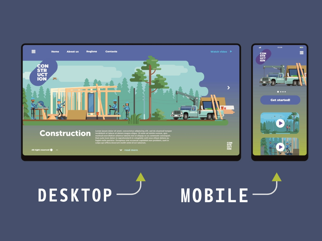
Adaptive Design: This approach focuses on providing tailored experiences for specific devices. It uses multiple fixed layout designs, each one targeting a particular device type or screen size. When a user accesses the website, the server detects the device and delivers the corresponding layout. This precision allows for a highly customized experience, optimizing performance and aesthetics for each device. For instance, a desktop version might offer a more complex interface with multiple columns and larger images. While the mobile version simplifies the layout to fit smaller screens and touch interactions. However, creating and maintaining these multiple versions can be resource-intensive, requiring significant time and effort from the design and development teams.
Responsive Design: In contrast, responsive design ensures a consistent experience across all screen sizes by using a single, fluid layout that adjusts dynamically based on the viewport. This approach relies on flexible grids, images, and CSS media queries to automatically rearrange and resize elements. Ensuring that the website looks and functions well on any device, from large desktop monitors to small smartphones. Responsive design is typically more efficient to implement and maintain, as it requires only one version of the site. However, it may not offer the same level of device-specific optimization as adaptive design, which could be a drawback for projects needing highly customized interfaces.
Call to Action
When deciding which approach to use, it’s essential to evaluate your project’s needs and resources. Consider factors such as the target audience, the range of devices they use, the complexity of the site’s content, and the available budget and timeline. By making an informed choice between these two approaches, you can enhance your website’s performance. In addition, you can improve user engagement, and ensure accessibility for all users. Whether you opt for the precision of adaptive design or the fluidity of responsive design, the key is to focus on creating an optimal. Both methods have their strengths and can significantly impact how users interact with your site. Ultimately, the goal is to provide a seamless and enjoyable experience that keeps users engaged, regardless of the device they are using.