
Table of Contents
Which is Right?
As technology continues to evolve, designing websites that are both visually appealing and accessible on a wide range of devices has become increasingly important. Two common approaches to website design are adaptive design and responsive design. While both approaches aim to provide a better user experience on different devices, they differ in their approach and methodology. In this article, we will explore the top 5 differences between adaptive and responsive design. By understanding these differences, you can determine which approach may be best suited for your website and its target audience.

What is Adaptive Design?
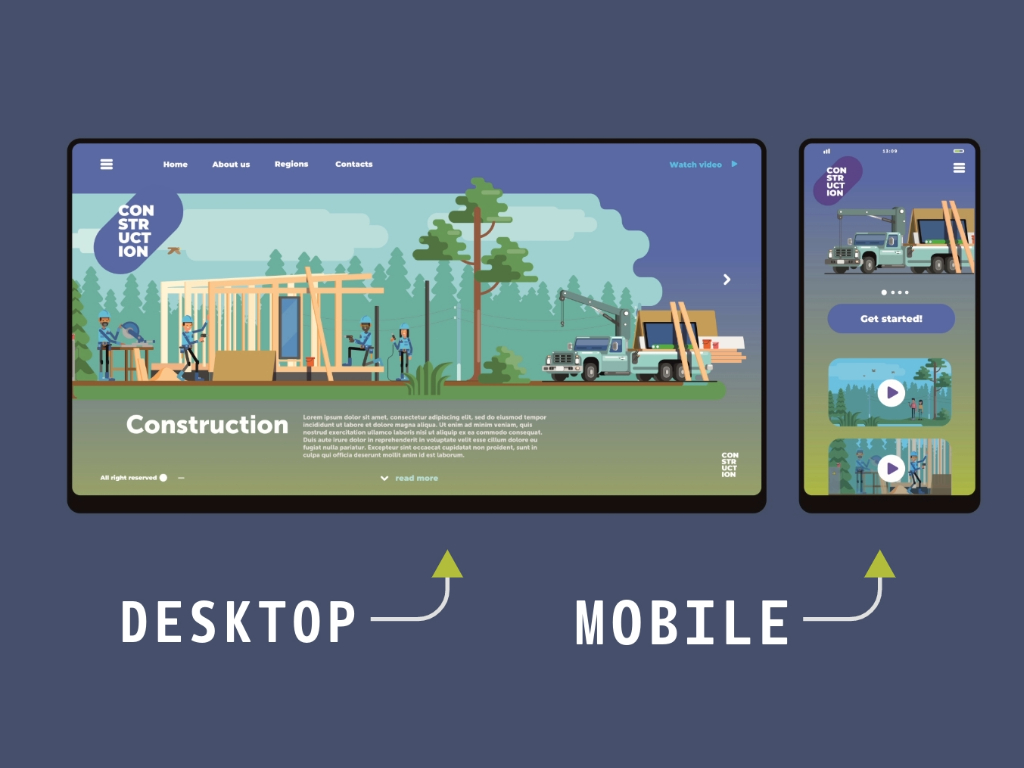
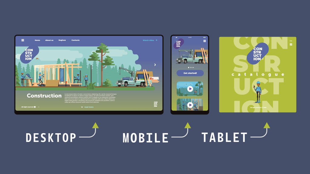
Adaptive web design is an approach to creating websites that involves developing multiple layouts and designs that can adapt and change based on the characteristics of the user’s device, such as screen size, resolution, and orientation. Think of it as having two different experience for two different devices. This technique allows websites to deliver an optimized browsing experience across various devices, including desktop computers, laptops, tablets, and smartphones. Unlike responsive web design, which typically uses fluid grids and flexible layouts to adjust content based on screen size, adaptive web design relies on predefined layout sizes that are specifically tailored to different device categories. But we are not done.
These layouts are designed to target specific breakpoints, or thresholds, at which the website’s appearance and functionality are adjusted to accommodate the capabilities and limitations of the user’s device. Adaptive web design often involves creating separate versions of a website for different device categories, such as desktop, tablet, and mobile, each with its own set of optimized layouts and designs. These versions may share some common elements and content, but they are customized to provide the best possible user experience for each device type.
Browsing Experience
The key advantage of adaptive web design is its ability to deliver a consistent and optimized browsing experience across a wide range of devices, ensuring that users can access and interact with the website effectively regardless of their device preferences. However, it can require more upfront planning and development effort compared to responsive web design, as designers and developers need to create and maintain multiple versions of the website to support different devices. Also lots of money.
The key advantage of adaptive design is that it allows for flexibility and the ability to make modifications to the study protocol based on the accumulating data. This can help to ensure that the study is efficient and cost-effective and that it is focused on the most important aspects of the research question. Adaptive design can also help to increase the likelihood of success by identifying and addressing potential problems early in the study. One example of adaptive design in clinical trials is the group sequential design. In this design, the study is divided into several stages or interim analyses. At each stage, data is analyzed to determine whether the study should continue, be stopped early, or be modified. This approach allows for the early detection of treatment effects or safety concerns and can reduce the overall sample size required for the study.
Dose Finding
Another example of adaptive design is the adaptive dose-finding design. In this design, the dose of the treatment is adjusted based on the accumulating data, with the goal of identifying the optimal dose for the treatment. This approach can help to reduce the time and cost required to identify the optimal dose and can help to ensure that patients receive the most effective treatment. There are several challenges associated with adaptive design, however. One of the main challenges is the need for careful planning and preparation. The study protocol must be designed in such a way that it allows for modifications to be made in a controlled and systematic manner. This requires careful consideration of the study objectives, the endpoints, and the statistical methods that will be used to analyze the data.
Adaptive design requires sophisticated statistical methods to ensure that the modifications are made in a way that is scientifically valid and that the results are reliable. This requires a team of statisticians with expertise in adaptive design and the ability to develop and implement the necessary statistical methods. In addition, there is a risk of bias in adaptive design studies. The modifications made to the study protocol can introduce bias if they are not made in a way that is scientifically rigorous. For example, if the modifications are made based on the results of exploratory analyses or post-hoc testing, the results may be biased and may not be generalizable to the broader population.
So then, What is Responsive Design?
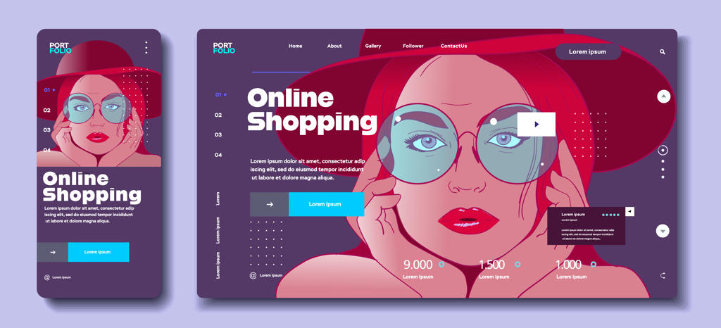
Responsive design is an approach to web design that allows a website to be viewed on a wide range of devices and screen sizes. With the proliferation of mobile devices such as smartphones and tablets, it is becoming increasingly important for websites to be designed in a way that allows them to be easily viewed and navigated on any device. Responsive design involves using a flexible grid system that adjusts to the size of the screen on which it is being viewed. This allows the website to adapt to different screen sizes and orientations, ensuring that it remains readable and usable on any device. Responsive design also involves the use of fluid images and flexible text that can be resized and repositioned to fit the screen.
One of the key advantages of responsive design is that it allows for a consistent user experience across devices. With a responsive website, users can access the same content and functionality regardless of the device they are using. This can help to increase engagement and improve user satisfaction, as users do not need to switch between different versions of the site. Another advantage of responsive design is that it can help to improve search engine optimization (SEO). Google and other search engines prioritize websites that are mobile-friendly, and responsive design is one of the most effective ways to ensure that a website is mobile-friendly. By improving SEO, responsive design can help increase traffic to a website and improve its visibility online.
Codebase
Responsive design also has several benefits for website developers. By using a single codebase for all devices, developers can save time and resources compared to building separate websites for desktop and mobile devices. This can help to reduce costs and improve the efficiency of the development process. However, there are also several challenges associated with responsive design. One of the main challenges is the need to design for a wide range of screen sizes and orientations. This requires careful planning and testing to ensure that the website remains usable and readable on all devices. It can also be challenging to optimize performance for different devices, as the processing power and connectivity of devices can vary widely.
Another challenge is the need for careful consideration of content and functionality. With a responsive website, it is important to ensure that content and functionality are accessible and usable on all devices. This may require simplifying or rearranging content to ensure that it is usable on smaller screens. In addition, responsive design requires ongoing maintenance and updates to ensure that it remains effective. As new devices and screen sizes are introduced, it may be necessary to update the website to ensure that it remains compatible and usable on all devices.
5 differences between adaptive vs responsive design
- Approach to design: Adaptive design uses a static layout approach and creates different layouts for different screen sizes, while responsive design uses a fluid grid system that adjusts to the size of the screen.
- The number of layouts: Adaptive design typically creates multiple fixed layouts for different device sizes, while responsive design uses a single layout that adapts to the screen size of the device.
- Design complexity: Adaptive design can be more complex and time-consuming to create, as it requires designing and developing multiple layouts, while responsive design is generally simpler and easier to maintain.
- Customizability: Adaptive design allows for more customization and control over how the website appears on different devices, while the responsive design may require compromises in design to ensure that the website remains usable on all devices.
- Device support: Adaptive design may not support all devices, as it requires designing and developing specific layouts for each device size, while responsive design is designed to work on any device and screen size.

Approach to design
Adaptive design and responsive design are two approaches used to create websites that can be accessed on different devices with varying screen sizes. Adaptive design involves a static layout approach, which means that designers must create multiple layouts for different device sizes or categories. This approach involves developing separate designs for desktop, tablet, and smartphone screens, among others. Designers create layouts based on the specific device, optimizing the website for each screen size. As a result, websites that use adaptive design may offer a more tailored user experience for specific devices.
In contrast, responsive design uses a fluid grid system that adapts to the size of the screen. Designers create one layout that adjusts to the screen size of any device, allowing the website to adapt without requiring separate designs for each device. This approach simplifies the design process and ensures that the website is accessible on any device, regardless of the screen size. While a responsive design may require some compromises in design to ensure the website remains usable on all devices, it offers greater consistency across devices, ensuring a more uniform user experience.
Number of Layouts
Adaptive design and responsive design are two popular approaches used to create websites that can be accessed on different devices with varying screen sizes. In adaptive design, designers typically create multiple fixed layouts for different device sizes. This allows for more precise control over how the website appears on each device, ensuring that the website looks and functions optimally on each screen. The use of multiple layouts optimized for different screen sizes can result in a more tailored and specific user experience. However, creating multiple designs can be time-consuming and resource-intensive, as designers must develop each layout for a specific device size or category, such as desktop, tablet, or smartphone.
Responsive design, on the other hand, uses a single layout that adapts to the screen size of the device. This approach simplifies the design process, as designers need only create one layout that will adjust to the screen size of any device. However, this approach may require more compromises in design to ensure that the website remains usable on all devices. Designers must ensure that the website is accessible and functional on all screen sizes, which may result in design compromises such as changes to font sizes or the removal of certain design elements. Despite these challenges, responsive design offers greater consistency across devices, ensuring a more uniform user experience. This approach has become increasingly popular as the use of mobile devices has grown, making it essential for websites to be accessible on any device.
Design Complexity
Adaptive design and responsive design are two approaches that web designers use to ensure that websites are accessible and user-friendly on devices of different screen sizes. Adaptive design can be more complex and time-consuming to create than responsive design, as it requires designers to create multiple layouts for different device sizes. This approach is more resource-intensive, as designers must optimize each layout for specific screen sizes and device categories. The process of creating multiple layouts for different devices can take a considerable amount of time, which can be a disadvantage for businesses and individuals who require a quick turnaround time for their website development projects. However, adaptive design may offer a more tailored user experience for users accessing the website from different devices.
RD is a website design approach that uses fluid grids and CSS media queries to ensure that the layout and content of the website adapt to the screen size of the device being used to access it. With this approach, designers only need to create one layout that adjusts to different screen sizes, making the design process more streamlined and efficient. This means that the website will look and function optimally on any device, without requiring the creation of separate layouts for each device.

Maintenance
The simplicity and ease of maintenance associated with responsive design make it a popular choice for businesses and individuals who want to create a website quickly and efficiently. However, the website may not offer the same tailored user experience as adaptive design, as the layout is not optimized for specific device sizes. Since the same layout is used for all devices, some design elements may need to be adjusted or removed to ensure that the website remains functional and usable on smaller screens. Nonetheless, responsive design is a flexible and versatile approach that can help businesses and individuals create websites that are accessible and user-friendly across different devices.
Customization
Adaptive design, for those designers who want to live on the edge, offers a greater level of customization and control over how the website appears on different devices. With the ability to create specific layouts for each device size or category, designers have the freedom to create a truly tailored experience for users. It’s like creating a bespoke suit for each device – a little bit extra, but oh so worth it! However, this approach can be a tad bit time-consuming and resource-intensive, making it a challenge for those looking for a quick and easy solution.
In contrast, responsive design takes the “one size fits all” approach, offering a more consistent user experience across different devices. It may require designers to make compromises in design, but it ensures that the website remains usable on all devices. Think of it as the “swiss army knife” of website design – versatile and dependable. While it may not offer the same level of customization as adaptive design, it does allow for greater flexibility and simplicity, making it a popular choice for businesses and individuals who want a website that just works. So, whether you’re a designer who wants to show off their skills or just someone who wants a website that works on any device, there’s an option out there for you!
Device Support
When it comes to website design, the choice between adaptive and responsive design can have a significant impact on how the site performs across different devices. While adaptive design may provide more precise control over how the website appears on each device, it can be limited by the number of devices it supports. This is because it requires designing and developing specific layouts for each device size or category, which can be time-consuming and resource-intensive. It’s like building a custom engine for each car model – while it may provide optimal performance, it’s not always practical.
On the other hand, responsive design is like a chameleon, adapting to the environment around it. It’s designed to work on any device and screen size, making it a more flexible solution. This approach uses fluid grids and CSS media queries to adjust the layout and content of the website to fit the screen size of the device being used to access it. However, this adaptability may require designers to make design compromises to ensure that the website remains usable across a wide range of devices. It’s like using a universal adapter – while it may not provide the best fit for every socket, it ensures that the device can be powered on in any location. In the end, the choice between adaptive and responsive design will depend on the specific needs of the website and the devices it will be accessed from.
Conduct User Research (UX) Before Deciding
User Research in User Experience (UX) Design is a crucial process that involves understanding the needs, behaviors, and motivations of your target audience through observation techniques, task analysis, and other feedback methodologies. Before deciding between adaptive and responsive design for your digital product, conducting User Research is essential for a multitude of reasons. The core of UX design is to cater to the user’s needs, and User Research is the most effective way to gain insights into what users actually need from your product. Adaptive and responsive designs cater to different user needs and contexts. While responsive design ensures that a website’s layout adjusts smoothly across different screen sizes, adaptive design delivers multiple fixed layout sizes based on the detected screen size. Understanding the specific needs of your users helps in determining which design approach will provide the most value.
Steve Krug, a renowned usability consultant and author of “Don’t Make Me Think,” once said, “The best way to ensure your Web site is usable is to test it with real users.” This quote emphasizes the importance of involving real users in the design process to create user-centered designs. User Research provides direct insights from users, ensuring that the design choices, such as choosing between adaptive and responsive designs, are informed by actual user needs and not assumptions.
Enhancing User Experience
User Research helps in creating a design that is not just visually appealing but also functionally relevant to the users. For example, if your research indicates that a significant portion of your audience accesses your website through mobile devices in areas with fluctuating internet speeds, an adaptive design might be more suitable, as it can provide optimized layouts for mobile devices and potentially reduce loading times. On the other hand, if your audience uses a wide range of devices and screen sizes, a responsive design would ensure a consistent experience across devices.
Reducing Development Time and Costs
Investing in User Research before making design decisions can significantly reduce development time and costs. By understanding the needs and behaviors of your users early on, you can make informed decisions that prevent costly redesigns and redevelopment later in the project lifecycle. For instance, if User Research reveals that your primary audience uses modern browsers on high-resolution devices, you might prioritize responsive design to leverage its flexibility and future-proofing qualities. User Research aligns the design of your product with your business goals. Whether your goal is to increase conversions, boost engagement, or ensure customer satisfaction, understanding your users’ preferences and behaviors through research will guide you in choosing the design approach that best supports these goals. For example, if increasing mobile conversions is a key business goal, User Research might reveal that an adaptive design, with layouts optimized for mobile devices, could lead to better conversion rates.
Ensuring Accessibility and Inclusivity
User Research emphasizes designing for all users, including those with disabilities. By understanding the diverse needs of your user base, including those who rely on assistive technologies, you can make informed decisions about which design approach will offer the most accessible and inclusive experience. For example, adaptive design might allow for more tailored experiences for users with specific needs, while responsive design ensures broad accessibility across devices.
Bottom Line
Adaptive and responsive design are two popular approaches to designing websites for a variety of screen sizes and devices. Adaptive design involves creating multiple fixed layouts for different device sizes, while responsive design uses a single layout that adjusts to the screen size of the device. While both approaches have their advantages and disadvantages, the choice between them ultimately depends on the specific needs of the website and its users.
As Froy C. Perez, Founder at UXMinify, explains, “Adaptive design can offer more precise control over how the website appears on each device, but can be time-consuming and resource-intensive. Responsive design, on the other hand, simplifies the design process but may require more compromises in design to ensure that the website remains usable on all devices.” Adaptive design may be preferred for websites that require a highly tailored experience for users, such as e-commerce sites or complex web applications. Responsive design may be a better choice for sites that prioritize accessibility and ease of use across a wide range of devices, such as news sites or blogs.
Ultimately, the decision between adaptive and responsive design depends on the User Research responses, the specific needs and goals of the website, as well as the devices and screen sizes it will be accessed from. Both approaches have their strengths and weaknesses, and it’s important to carefully consider the trade-offs between them to determine which approach is best for a particular project.