web | apps

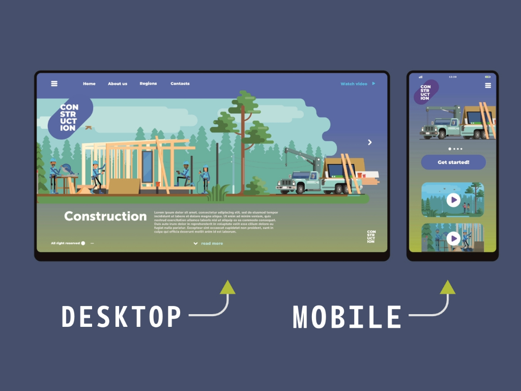
The Business Case of Adaptive Versus Responsive Design

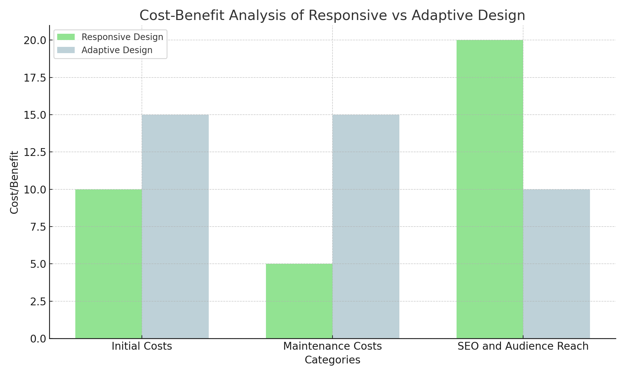
Businesses often grapple with the choice between adaptive and responsive design. Both approaches aim to enhance user experience across various devices, yet they differ significantly in execution and benefits. 

Table of Contents

Understanding Adaptive vs Responsive Design

Exploring Responsive Design

Responsive design has become the gold standard in web development. It involves creating a single flexible layout that adjusts seamlessly across different screen sizes and orientations. This fluid approach ensures a consistent user experience, whether on a smartphone, tablet, or desktop. The key advantage of responsive design lies in its simplicity and efficiency. Instead of developing multiple versions of a website for different devices, businesses can invest in one adaptable site.

Why Businesses Prefer Responsive

Responsive design stands out primarily due to its cost-effectiveness. Developing and maintaining a single, flexible website is significantly less expensive than creating multiple fixed-layout versions tailored for different devices. This streamlined approach translates into substantial savings both in initial development and ongoing maintenance. When updates or modifications are needed, they can be applied universally to the single responsive website, rather than having to implement changes separately across multiple adaptive versions. This efficiency not only reduces costs but also simplifies the management process, ensuring consistency across the entire web presence. Furthermore, responsive design plays a critical role in enhancing search engine optimization (SEO). Search engines like Google prioritize mobile-friendly websites in their rankings, and responsive design inherently aligns with this preference. By adopting a responsive design strategy, businesses can improve their search engine rankings, leading to increased visibility and higher organic traffic. This SEO advantage is a significant benefit, as higher search rankings can drive more potential customers to the site, ultimately boosting business performance.

What’s the Device?

In addition to cost and SEO benefits, responsive design also addresses the growing diversity in device usage. As the number and variety of devices continue to proliferate, from smartphones and tablets to laptops and large desktop monitors, ensuring accessibility across all platforms becomes crucial. Responsive excels in this area by automatically adjusting the website’s layout to fit the screen size and orientation of any device. This capability ensures a seamless and consistent user experience, regardless of whether the user is accessing the site from a small mobile screen or a large desktop monitor. Moreover, by providing a consistent user experience across various devices, responsive design helps cater to a broader audience. This inclusivity is essential in today’s digital landscape, where users expect websites to function flawlessly on any device they choose to use. By adopting responsive design, businesses can meet these expectations, enhancing user satisfaction and engagement. This broad accessibility can lead to increased customer loyalty and a wider reach, as users are more likely to return to and recommend websites that provide a positive experience across all their devices.

Mobile only
Responsive Design

Exploring Adaptive Design

Adaptive design, on the other hand, involves creating multiple fixed layouts tailored to specific screen sizes. When a user accesses a website, the server delivers the appropriate layout based on the device’s characteristics. While this approach can offer a more tailored experience, it comes with increased complexity and cost.

The Situational Benefits of Adaptive Design

Adaptive design shines in specific contexts where a highly customized user experience is paramount. For instance, e-commerce platforms with complex functionalities might benefit from adaptive design to optimize performance and user engagement on different devices. Additionally, industries like gaming, where user interface nuances are critical, can leverage adaptive design for superior user experiences. However, the business case for adaptive design often falls short compared to responsive design due to the higher initial investment and ongoing maintenance costs. Developing multiple layouts requires more resources and a dedicated team to manage the intricacies of each version.

Comparing User Experience

One of the most compelling arguments for responsive design is its ability to deliver a consistent user experience across devices. Users appreciate familiarity and ease of navigation, and responsive design excels in providing this continuity. On the contrary, adaptive design might offer a slightly more optimized experience for specific devices, but it risks creating disjointed interactions as users switch between different devices.

The Role of User Feedback

User feedback often highlights the strengths of responsive design. For example, users report fewer issues with navigation and content display on responsive websites. This positive feedback translates into higher user satisfaction and retention rates, which are crucial for business growth. Furthermore, responsive design’s flexibility ensures future-proofing against new devices and screen sizes. As the technology landscape evolves, responsive websites can adapt without requiring extensive redesigns, unlike adaptive designs that may need complete overhauls.

Cost-Benefit Analysis of Responsive Design

From a business perspective, the cost-benefit analysis overwhelmingly favors responsive design. One of the primary reasons for this preference is the lower initial development costs. Creating a single responsive website is inherently less expensive than developing multiple adaptive versions tailored for different devices. This reduction in upfront costs is particularly beneficial for small to medium-sized businesses with limited budgets, as it allows them to allocate resources more efficiently and invest in other critical areas of their operations. In addition to the lower initial costs, responsive design offers significant long-term savings through streamlined maintenance. Managing a single responsive site is much simpler and less resource-intensive compared to maintaining multiple versions of the same website. Whenever updates or changes are needed, they can be implemented universally across the entire site, rather than having to be applied individually to each adaptive version. This not only saves time and effort but also ensures consistency and uniformity in the website’s appearance and functionality across all devices.

Mobile is Priority

Moreover, responsive has the potential to substantially improve search engine optimization (SEO) rankings. Search engines, particularly Google, prioritize mobile-friendly websites in their search results. A responsive design inherently aligns with this preference, leading to higher visibility and better search rankings. Higher SEO rankings translate into increased organic traffic, which is a crucial factor for business growth. As more users find the website through search engines, the potential for conversions and sales increases, amplifying the overall return on investment (ROI). The broader audience reach facilitated by responsive design further enhances its business value. In today’s digital landscape, users access websites from a variety of devices, including smartphones, tablets, laptops, and desktops. Ensuring a seamless user experience across all these devices is essential for capturing and retaining a diverse audience. Responsive design achieves this by automatically adjusting the website’s layout to fit the screen size and orientation of any device, providing a consistent and user-friendly experience. This inclusivity can lead to higher user satisfaction, increased customer loyalty, and a broader market reach.

Cost-Benefit Analysis of Responsive Design

Future Trends of Responsive Design

Integration of AI and Machine Learning

Artificial intelligence (AI) and machine learning (ML) are revolutionizing various industries, and web design is no exception. AI and ML can enhance user experiences by enabling websites to dynamically adapt based on user behavior and preferences. For instance, AI algorithms can analyze user interactions and personalize content layouts in real-time, ensuring that each user receives a tailored experience.

Advanced Mobile-First Design

While mobile-first design has been a best practice for some time, the future will see even more emphasis on optimizing experiences for mobile devices. As mobile internet usage continues to surpass desktop usage, designing with a mobile-first mindset will become increasingly critical. This approach involves prioritizing the mobile user experience from the outset and ensuring that websites are fully functional and aesthetically pleasing on smaller screens.

Progressive Web Apps (PWAs) in Responsive Design

Progressive Web Apps (PWAs) are gaining popularity as they combine the best features of web and mobile applications. PWAs offer a seamless, app-like experience directly within the web browser, without the need for downloads or installations. They provide benefits such as offline access, push notifications, and faster loading times, all while being responsive to various screen sizes.

Enhanced Accessibility and Inclusivity

As awareness of digital accessibility grows, the future of responsive design will place a stronger emphasis on inclusivity. Ensuring that websites are accessible to users with disabilities is not only a legal requirement in many regions but also a moral imperative. Future designs will incorporate best practices for accessibility, such as proper use of ARIA (Accessible Rich Internet Apps) landmarks, keyboard navigability, and compatibility with screen readers.

But What If I Still Want to Convert to Adaptive Design?

Responsive design and adaptive design both aim to enhance user experience across different devices, but they approach the problem differently. Responsive design uses flexible grids and layouts that fluidly resize to fit any screen, whereas adaptive design delivers multiple distinct layouts tailored to specific screen sizes. Converting a website from a responsive design to an adaptive one involves a strategic approach to provide optimized layouts for different devices at specific breakpoints. This transition requires a blend of technical know-how and meticulous planning. Here’s a step-by-step process to guide you through the conversion.

Analysis and Planning

Begin by evaluating your existing responsive website to understand its performance across various devices. Utilizing analytics, pinpoint the most common device resolutions that visit your site. From there, define specific breakpoints for device categories such as phones, tablets, and desktops, commonly set at widths like 320px, 768px, and 1024px.

Design Phase in Responsive Design

Move on to the design phase by developing wireframes tailored to each breakpoint. These should focus on the strategic placement and functionality of core elements. Then, create user interfaces for each breakpoint, emphasizing optimized interactions and easy accessibility for users on those devices.

Development in Responsive Design

Adapt the HTML structure of your website to support multiple fixed layouts, potentially involving the addition of specific container elements for each breakpoint. Employ CSS media queries to apply different stylesheets or rules based on the device’s screen size, managing how the layout adapts at each breakpoint. Enhance functionality with JavaScript for device detection and to dynamically adjust content or resources according to the detected device.

Testing and Optimization

Conduct extensive device-specific testing using actual devices or emulators to ensure each layout functions as planned. Perform performance checks, optimizing images, scripts, and CSS to enhance loading times, crucial for mobile devices. Gather user feedback and analyze data to continuously refine and improve the layouts based on real-world use and preferences.

Deployment and Improvement

Consider a phased rollout of the adaptive design, especially for larger, more complex sites. This allows gradual adaptation and troubleshooting. Post-deployment, maintain vigilance in monitoring user interactions and site performance metrics. Adaptive designs might necessitate regular adjustments as new devices enter the market and user behaviors shift.

VPS Hosting

Secure VPS Hosting Starting at $5.99

Cost-Effective Plans for All Levels of Success

Bottom Line

The future of responsive design is set to be shaped by technological advancements and an increased focus on user-centric experiences. The integration of AI and machine learning will enable dynamic, personalized content delivery, while advanced mobile-first design will prioritize efficient and engaging mobile experiences. The rise of Progressive Web Apps will blur the lines between web and mobile applications, offering the best of both worlds. As technology advances, responsive design frameworks are also evolving. Innovations like CSS Grid and Flexbox enhance the capabilities of responsive design, enabling more sophisticated and flexible layouts. Businesses can leverage these advancements to create visually appealing and highly functional websites without the complexity of adaptive design. Moreover, responsive design aligns with the growing emphasis on inclusivity and accessibility in web development.

Businesses can cater to diverse user needs and preferences, promoting inclusivity and broadening their customer base. Ultimately, the choice between adaptive and responsive design depends on the specific needs and goals of a business. However, the business case for responsive design is compelling, offering cost savings, improved SEO, and a consistent user experience. While adaptive design has its place in niche scenarios, the broader applicability and benefits of responsive design make it the preferred choice for most businesses. As businesses navigate the complexities of web development, embracing responsive design can drive growth, enhance user satisfaction, and ensure long-term success. By understanding the distinct advantages of responsive design, companies can make informed decisions that align with their strategic objectives and deliver exceptional digital experiences.

Join by SMS | Email for UX-UI Design updates.

Scroll to Top